For this blog post, I’m trying something different. This is a jupyter notebook that I’m using to study some data, and just dumping my brain out in text. If I can easily export this to a format that works with hugo, this might become a common occurrence.
For this one, I’m leaving the code in. There isn’t that much of it, but I think it’s fun to show how much visualization per line of code you can get with seaborn and pandas.
Why ban Atlantic Salmon fishing?
The Norwegian government has decided to close down salmon fishing in most rivers in southern Norway, including Trøndelag, for the summer of 2024, effective from June 23rd.
This is a decision that has huge economic implications for many farmers and landowners in the region, so we already know it’s not done without good reasons. When the ban was announced, the Environmental Agency announced that they were doing it because there was a real risk that there would be lasting damage to the Atlantic Salmon population in the region if they didn’t act. Here’s what they said:
- The number of salmon caught has been much lower than usual.
- This is particularly true for big salmon (the ones that have the best genetic material, which we want to preserve).
- We’re observing fewer salmon at the mouth of Trondheim fjord than usual.
I think these are excellent reasons to act, but I want to see some of the data to better understand how grave the situation is. For this reason, I’ve downloaded all catch statistics for a number of the rivers in Trøndelag from Elveguiden, and I’m going to be doing some visualizations to see if I can understand the situation better.
First, we’re going to do some imports and set up plots, then do a light cleaning of the dataset, to make it a little easier to work with. We’ll also take a look at the weight of the fish, to check how rare it is to catch big fish, and what it means that there are fewer.
import pandas as pd
import seaborn as sns
import numpy as np

sns.set_theme(
    style="white",
    context="notebook",
    palette="pastel",
    rc={
        "figure.figsize": (16, 8),
        "figure.frameon": False,
        "legend.frameon": False,
    }
)

df = pd.read_parquet("data/clean/lakseboers.parquet", columns=[
    "river", "date", "weight", "fish_type.name"
]).pipe(
    lambda df: df.loc[df["fish_type.name"] == "Salmon"].drop(columns=["fish_type.name"])
).pipe(
    lambda df: df.loc[df["weight"] > 0]
).rename(columns={
    "weight": "weight(kg)", "length": "length(cm)"
})

sns.displot(
    df, x="weight(kg)", bins=30
).set_titles("Distribution of salmon caught by weight");
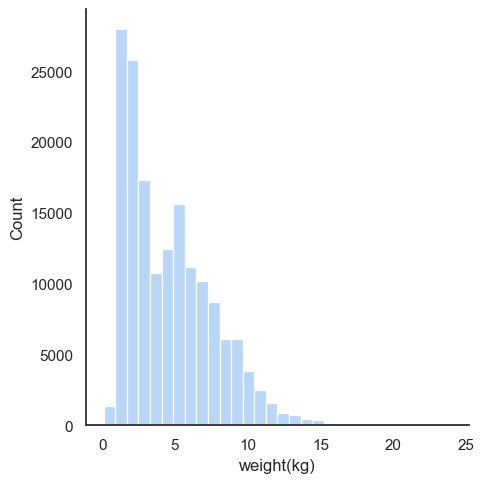
What this shows is that very few salmon ever grow to exceed 10kg. A histogram like this isn’t the best way to appreciate just how rare those fish are, so let’s try to plot the cumulative distribution instead. It’s a little trickier to read these plots if you’re not used to them, but the idea is that the curve shows you what percentage of the total is below a given weight. It’s pretty informative, once you know how to read it, so bear with me:
g = sns.displot(
    df, x="weight(kg)", kind="ecdf"
)
g.set_titles("Cumulative distribution of salmon caught by weight")
for ax in g.axes.flat:
    ax.axvline(x=7, color="red", linestyle="--")
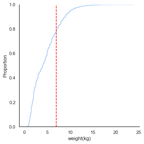
I’ve plotted a vertical red bar at 7kg, because that’s the weight at which the Atlantic Salmon is considered to be a “big salmon”. The way you read this plot, is that you find out where on the Y-axis the curve is at 7kg, and that tells you the proportion of fish that is smaller than that. In this case, it looks like perhaps 80% of the salmon in the dataset are smaller than 7kg, so it’s pretty rare to catch such a big fish.
Then, we have a lot of rivers in this dataset, and some have naturally smaller fish in them than others. Let’s take a look at the distribution of fish caught by river, to check why some rivers are more popular fishing destinations than others:
sns.countplot(
    data=df.assign(
        size_kg=pd.cut(df["weight(kg)"], bins=[0, 7, 25], right=True)
    ),
    y="river", hue="size_kg"
).set_title("Number of salmon caught by river");
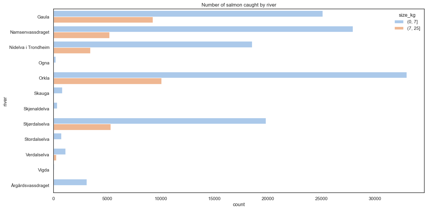
This tells me that most rivers in my dataset do not have a significant amount of catches of big salmon, so we’ll focus on the ones that do, and remove all other rivers. This also makes it easier to compare rivers side by side later on, since we have fewer of them. We’ll focus on the 4 big ones:
- Orkla
- Gaula
- Namsen
- Stjørdalselva
Next we’ll check if we have data for roughly the same amount of fishing seasons for each of those:
df = df.loc[
    df.river.isin({"Orkla", "Gaula", "Namsenvassdraget", "Stjørdalselva"})
].assign(
    river=lambda df: df.river.cat.remove_unused_categories(),
    year=lambda df: df.date.dt.year
)

sns.relplot(
    df.groupby(['river', 'year'], observed=False).size().rename("catches").reset_index(),
    x="year", y="catches",
    col="river", kind="line", col_wrap=2
);
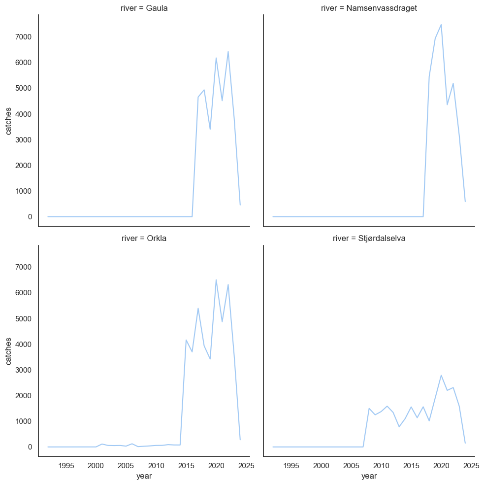
I think it’s probably going to be easier for us to study what’s going on if we throw out all data before 2015, since there’s so little data for the earlier seasons. After that, we can take a look at how catch statistics distribute throughout the fishing season, and try to compare to the current one.
df = df.loc[df.date >= "2014-12-31"]
season_start = df.date.dt.strftime("%Y-06-01").astype('datetime64[ns]')

df = df.assign(
    day_of_season=(df.date - season_start).dt.days,
    size=lambda df: np.where(df["weight(kg)"] >= 7, "over 7kg", "under 7kg"),
    season=lambda df: np.where(df.date.dt.year == 2024, "2024", "before 2024"),
)
catches = df.groupby(
    ["river", "year", "day_of_season", "size", "season"], observed=True
).size().rename("catches").reset_index()
catches = catches.loc[(catches.catches > 0) & catches.day_of_season.between(0, 90)]

for ax in sns.relplot(
    catches.astype({'year': 'string'}), x="day_of_season", y="catches", row="size",
    col="river", kind="line", hue="season", height=4, facet_kws={"sharey": False}
).axes.flat:
    ax.set_ylim(0, 80)
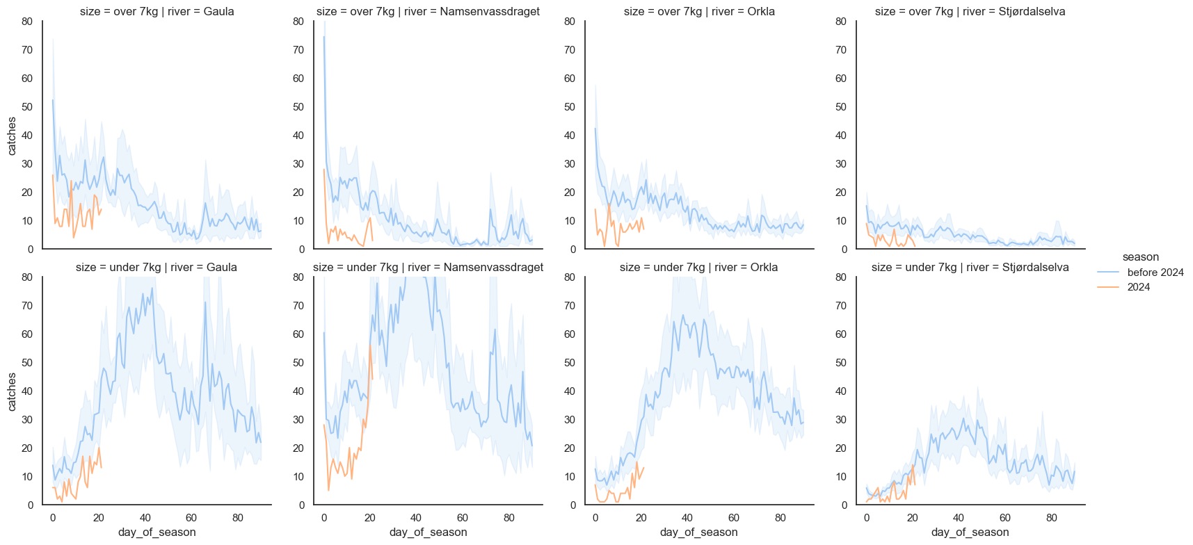
The shaded area is a 95% confidence interval. I think this plot shows us a number of interesting facts:
- It appears that the big salmon are caught early on in the season, so we would normally expect these numbers to drop off even more, later on
- The start of the current season looks like it might be the worst season on record for fish over 7kg in all 4 rivers
- It’s not particularly good for smaller salmon either
A line plot like this is reasonable for picking up trends, but as before, I think the cumulative plots are often better at estimating the state of affairs. So let’s do the cumulative plot as well:
catches = df.groupby(
    ["river", "year", "day_of_season", "size", "season"], observed=True
).size().rename("catches").reset_index().sort_values(by="day_of_season")

catches = catches.assign(
    catches=catches.groupby(["river", "year", "size", "season"], observed=True)["catches"].cumsum()
)
catches = catches.loc[catches.day_of_season.between(0, 30)]

sns.relplot(
    catches.astype({'year': 'string'}), x="day_of_season", y="catches", row="size",
    col="river", kind="line", hue="season", height=4, facet_kws={"sharey": False}
).set_ylabels("Cumulative catches");
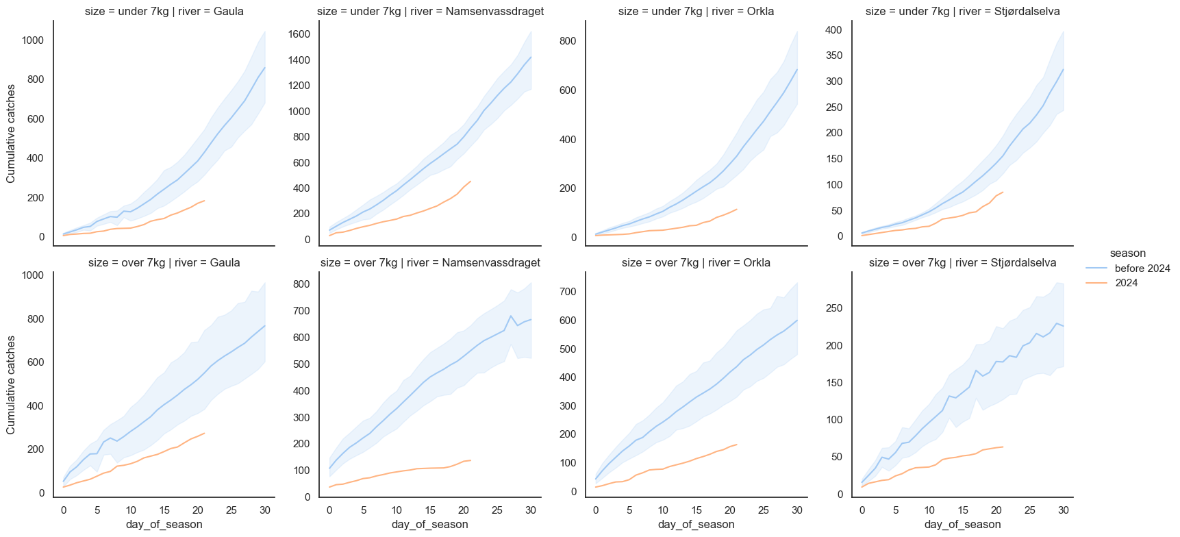
Ouch. What can I say, it looks like the government was right to ban salmon fishing in these rivers for 2024. The situation looks absolutely dire. Maybe there have been worse starts to the season in one or two of these rivers, but what we’re seeing seems to be that the situation is bad in all of them simultaneously. Just to make sure we’re not misunderstanding something, let’s plot the individual lines for all years too:
sns.relplot(
    catches.astype({'year': 'string'}), x="day_of_season", y="catches", row="size",
    col="river", kind="line", hue="year", height=4, facet_kws={"sharey": False}, palette="tab10"
).set_ylabels("Cumulative catches");
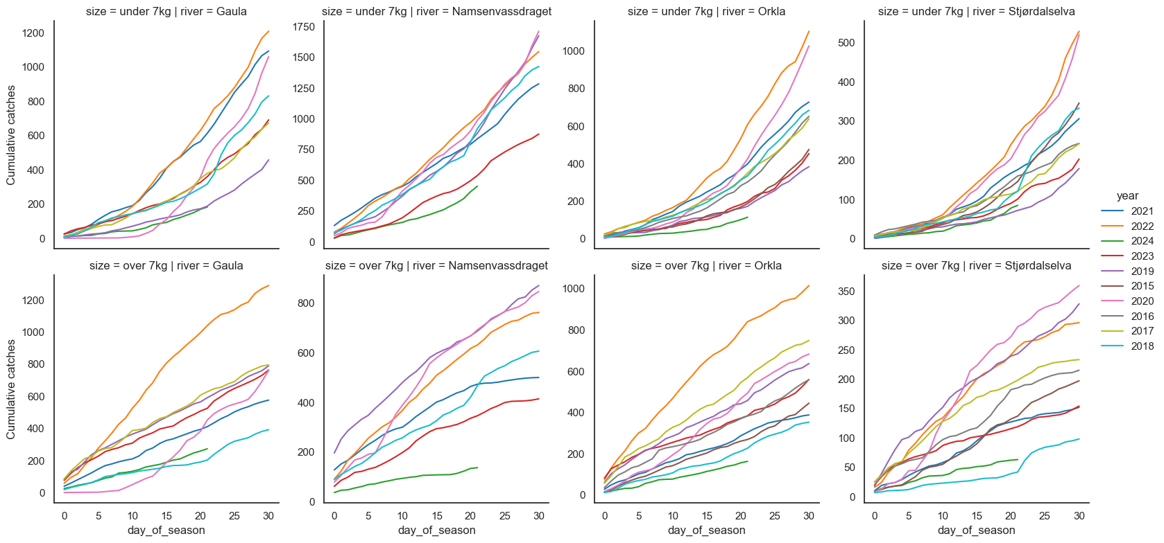
Okay, it’s bad in all four of these rivers, particularly for big salmon. For Stjørdalselva and Gaula, we have worse seasons on record, but just barely, and that was a summer with a drought in this region (2018). For Orkla and Namsen, we’re just looking at the worst season on record.
How did I turn it into a blogpost for hugo?
This was actually reasonably simple. I did it manually, but I think I can probably script it easily. Here’s what I did:
jupyter nbconvert --to markdown Salmon\ 2024.ipynbmv Salmon\ 2024_files content/posts/2024-06-27-salmon-banmv Salmon\ 2024.md content/posts/2024-06-27-salmon-ban/index.md- Added a frontmatter to the markdown file
- Fix all links in the markdown file by deleting the
Salmon%202024_files/prefix